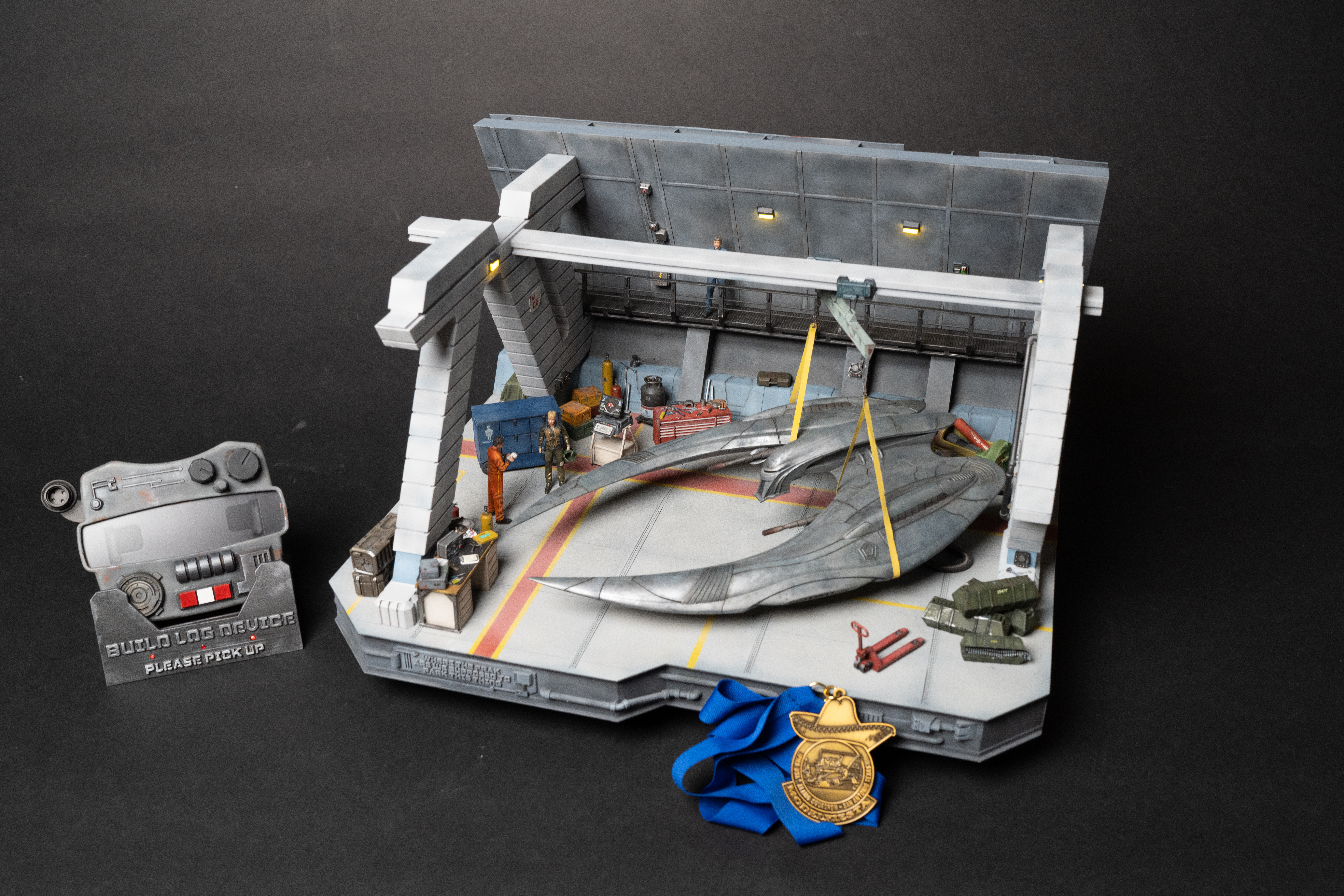
Cylon Diorama – mk.2
As you may have read, I recently completed the Cylon Raider diorama mk.1 shortly before the Rocky Mountain Hobby Expo (RMHE). When I got to the airport, I had… some issues… getting through TSA.
The majority of the damage was to the diorama base itself, with the ship and accessories surviving unscathed. During my initial sad venting, Matt uttered some words that will live in infamy: “You know you can just print the base on your new Bambu FDM 3D printer, right?”
And thus began a journey to Cylon Raider diorama mk.2.
My goal of this redesign was to use the mk.1 diorama as a blueprint and recreate as closely to the original as possible. I didn’t want YET MORE rabbit holes with this project, so the goal was to only make priority, minimal changes to the base. No big redesigns.
Designing and printing
When I returned home, I immediately set to work in Fusion. (Well first, I inspected the damaged and held vigil, then I got to work in Fusion) Within two weeks, I had a fully designed base and printing had started.
Since I hadn’t done something this big on the Bambu, and because the filament printing is so much stronger, it was a bit green field… so I had a take a second to design something smart. I got most of the way to smart, although I learned a lot of lessons along the way, especially about the best ways to connect and align the various pieces.
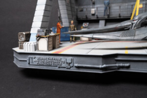
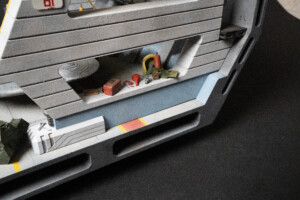
One of the biggest design changes was to include truly recessed side cutouts (rather than the implied versions I had in mk.1). These add a HUGE amount of awesome to the look of this diorama.
Because the base was significantly larger than the Bambu print bed, I had to divide it up into printable chunks. After a bit of testing, I got everything coming out like I wanted it to. As I was designing and test printing, I kept having to remind myself that I can include multiple bits of the design in one print piece. I didn’t have to have 30 separate components I was glueing together individually, I could print out one piece with everything already “attached”. The main consideration was which printer I wanted to print what pieces on. What needed high levels of precision detail had to be printed on the resin printer, bigger and not-as-detailed pieces came off the faster FDM printer.
Example: On the front of the mk.1 base, I had a series of greebles, including the custom name plate. I also had added styrene L-channel strips for detailing. When I printed the mk.2 base, I left the greebles and name plate off and printed the L channel as part of the base pieces. Vastly easier and more securely attached. But the greebles needed resin level detail. Great combo approach
Ready to start assembling the base
After a bunch of printing, I was ready to start assembling the base. Don’t mind the different colors of the various pieces. Just working my way through various color rolls of filament.
You’ll notice the white sheet styrene Cricut cut back wall exterior ribs. I opted to not include the ribs in the FDM printed wall sections. This was for a couple reasons:
- I wasn’t initially sure that I could get the robustness I wanted out of the FDM printing at that thickness. In retrospect, I probably could have. Especially if I’d added some bracing to the Fusion design. All that would have been mostly hidden anyway
- I thought it was going to be easier to just recut the existing rib files. Which I did. And discovered that they didn’t match the new CAD-drawn exterior wall. So I ended up having to redraw them anyway.
- I honestly just didn’t put as much thought into it as I should have. I thought about 70% through the process without fully considering/testing all the variables first. Live and learn. That’s engineering, amirite?
One change I did add that was wonderful was adding guide channels for the ribs that were printed into the wall itself. This made it much easier to get them glued on straight without having to measure and use a level, etc. One dumb choice on my part, driven by a need to shift my mindset about how I’m designing in Fusion vs. scratchbuilding is that the channels could have been much deeper and therefore more helpful. Live and learn.
Joining the base components
In another one of those live and learn moments, I used square holes and square pins to help align the parts for glueing. I used a lot of JB Weld on this project. (The fast drying kind, which I discovered I was using when I picked up a replacement pack recently and discovered it was the original slower drying formula)
In future projects, I want to use more woodworking joinery techniques in the Fusion design itself allowing the parts to slide together without requiring additional pins. The pins worked fine, but they didn’t align the parts as perfectly as they could have.
I glued everything together on the horizontal base surface effectively all at once. I had designed in clamping holes in base to help me clamp parts together and also to allow drywall screws to be used to pull everything together. This was to help hole while the glue was drying and to allow a mechanical bond over time too. I used my heavy 90 degree block to hold everything down. Once the glue had set enough for me to take off the clamps, I turned it over and let it final cure for 24 hours with the weight on the top and the riser glued into the riser channel I had design into the bottom of the base to help located placement of the riser.
Printing the vertical interior walls
The Bambu printer has a much larger print area and a much much faster print time than the resin printer. The mk.1 interior walls had to be split into multiple components just to fit in the resin printer and it took days to get all of them printed and then assembled, properly aligned. So I thought I’d try printing the walls all as a single piece with the Bambu.
This worked wonderfully, with one notable exception. Print time was vastly faster, but clean up took some time. You can see above that there were significant support requirements to print and when I removed them a lot of support gunk remained, Using a dental tool to remove that all and various files and tools to get it prepped and ready for paint, I decided this was still a good solution.
I left the top caps off the FDM print and printed those in resin because they have light fixtures on them; the detail was just too fine to work on the FDM. Still much, much faster of a process.
Above, you can see all the vertical parts tacked in place. It’s looking good!
Working time from return home from RMHE to this stage? 2 weeks. VASTLY faster than the mk.1 to get to this stage!
First problem: the back wall doesn’t fit
You’ll see in the pictures that come from here on, the black part of the back wall is now gray. I discovered in my test fitting that some measurement snafu in Fusion and real life caused a gap to be created between the back wall halves. Rather than chase it with putty, I bit the bullet and expended a bit more filament and time to just adjust the size and reprint. So glad I did. I hate that kind of putty work.
That said, it was time for putty work and prep work to get ready for priming.
Using liquid resin and a disposable makeup brush, I touched up the gaps, cured them, and then sanded them out. I did this all around the base which was now glued in two large parts: full horizontal base and full back wall. Several rounds of primer > fill, sand, prep > prime again, rinse repeat.
First round of wiring
In mk.2, the wiring for the lights was really well thought out (for the back wall, not so much for the horizontal base. We’ll get to that). In the back wall, I hollowed it out so I could easily run the wiring for the three lights through the interior of the wall and down into the horizontal base. Much different than just carving a channel in the foam of mk.1. The worst part of this process was removing the supports needed to print that hollow space on the Bambu, made particularly difficult with the three different angles on the wall halves. But once that was out, running wire was instant. It was heavenly simple.
With the wires run where they needed to be, I could glue the two halves together and then run the wires through the horizontal base too. A short while later, the back wall was glued to the horizontal base.
Working time to this point: 3 weeks.
Battery holder
I’ve written about how to use a USB phone charger battery to power your diorama lighting for hours and hours on the mk.1 build log, so I wont rehash here. But a couple things changed in this process on mk.2.
First, I change the battery to one I acquired from my wife. It was more like a deck of cards size and shape vs. the round cylinder mk.1 used. I had a bear of time getting that larger cylinder shape to fit, so the new battery was a better option. Plus, it has a read out to show how much battery percentage is left. Handy.
Second, I printed a mount for the battery, complete with a riser to make it easier to remove for charging or replacement, if necessary.
Non-slip deck texture
My least favorite thing to create on mk.1 was the sandpaper textured deck. I always hated it. I’ve seen the technique used before from other modelers to show asphalt or non-skid texture. It was fine, I guess. But I wasn’t happy with it and I hated working with it in this way.
When I created the now-defunct travel box for mk.1, I used a hammered metal effect spray paint. It was super cool and worked great. I wondered if there was a similar texture spray paint for something non-skid style. Off to Home Depot I went and found one. It worked great. Well, it worked great once I discovered you need to back up the spray can from the model further than traditional spray paint. You’re basically using the pebbling effect we try to avoid when airbrushing to your advantage here. But it turned out great and felt more inline with the consistent scale texture from the real world version.
Adding texture to the walls
To add textured to the walls, I used the same AK Easy Cast approach I used in mk.1 so I’ll let you read about that over there.
Adding the ribs and exterior paneling
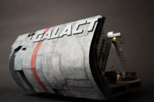
Other than adding the channels to mount the ribs more easily, the exterior wall was a near exact reproduction of the mk.1 version:
- Glued styrene ribs in place
- Attached sheet styrene (because it’s easy to curve)
- Attached the resin printed “GALACT” letters
- Attached some U-channel Evergreen strip styrene for some detail/texture
- Tapped on AK Easy Cast, let it dry and sanded it back a bit
Designing and placing the back wall popout
For the mk.2, I designed the back wall “popouts” and printed them on the FDM printer. Detail was pretty great and layer lines weren’t too much of a problem. And the great thing was that I only had a print out three pieces to glue in place quickly. I also painted them blue to match the show’s ship better this time around.
Painting begins
Once everything was glued, textured, primed and ready for paint, the mass volume of Tamiya paint usage began. This things big and sucked up paint like mad. Especially since I had to spray and spray again to adjust tones to get them where I wanted. White(ish) vertical walls, tan gray interior wall and deck color, Tamiya German Grey sides, blueish grey exterior colors as well as dark gray base color under the exterior panels.
Looking good!
Ink mottling
Using techniques described in the mk.1. build log, I used blue, black, and white inks to produce a mottled look on the exterior wall. I also painted the red stripe down the back, masking out the letters.
Glueing the vertical walls
This time around, I attached the cross beam and vertical walls together before I attached the vertical walls to the base like I did on mk.1. This made it easier to paint unit structures and not have to work around the wall structure.
I printed the cross beam in resin like mk.1 but with the addition that the mk.2 cross beam has the motor units printed into the beam itself. No glue this time. Should be easier to work with, less to clean up, and stronger support for the ship
Deck lines
Next came the most nerve wracking part of the build so far: painting the red and yellow lines on the deck.
After so many hours spend painting the deck, if I screwed up the red and yellow line work, I’d have to start over. And I almost had to when I did a touch up to part of the red line and didn’t properly mask around it to block red overspray. SMH.
But they turned out pretty great. I opted to add the more “show realistic” yellow strip outside the red stripes.
Working time to this stage: 8 weeks
From here, it was mostly just a task of moving the figures, ship, and accessories from the mk1 version over to the mk2. I didn’t take a ton of photos of this process but you can read up on the details of those things on the Cylon mk1 build page!
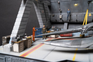
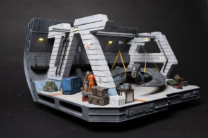
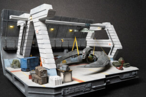
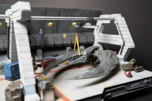
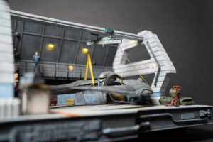
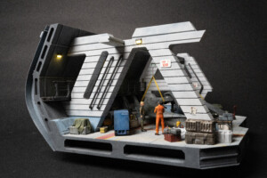
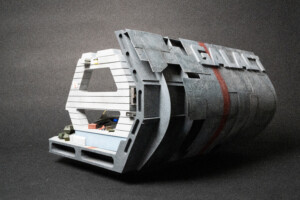
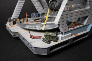
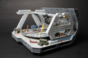
Final Images

